


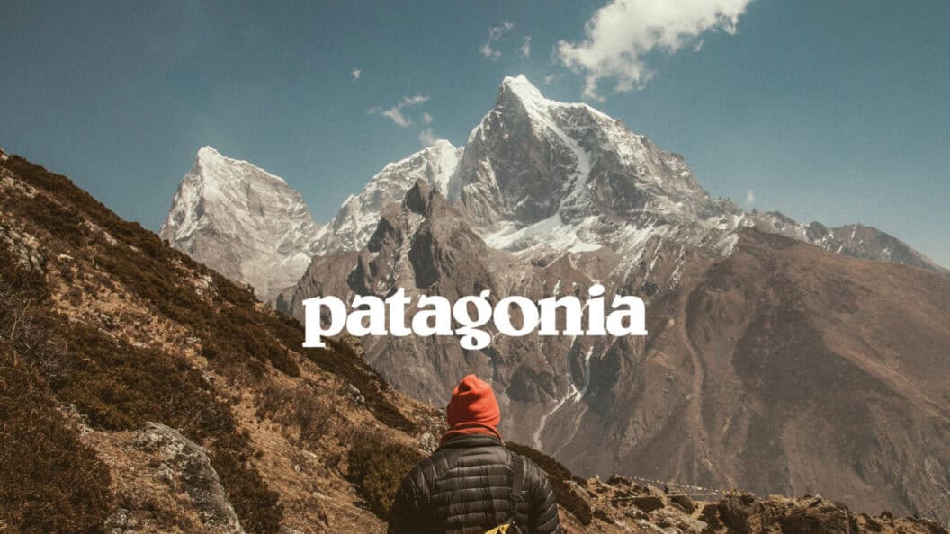
Introduction
Typography moves slowly. Trends in type rarely hit in big waves, they seep, settle, and silently reshape the visual landscape. And yet, in 2026, premium SMEs across Europe and the US are shifting toward a noticeably minimalist, deeply structured typographic language.
This isn’t an aesthetic trend. It’s a systems trend. A correction. Even a quiet rebellion.
Brands are realizing something simple and overdue:
When the type system works, everything else falls into place.
In this Industry Watch report, we break down what’s actually happening, why this shift matters, and how SMEs can use minimalist typography as a structural advantage instead of a visual shortcut.
A Shift Driven by System Failure, Not Style Trends
Minimalism rises every time the market becomes visually noisy.
But in 2026, noise isn’t the issue. Fragmentation is.
SMEs have more channels, more formats, more brand assets, and more internal creators than ever before. This creates tension in brand systems:
- too many weights
- inconsistent sizes
- decorative type used as a “quick fix”
- poor contrast
- no clear typographic hierarchy
- mismatched type decisions between teams
Most brands didn’t need new typography, they needed typographic discipline.
Minimalist type solves this not by making things pretty, but by making the system breathable:
- It removes friction.
- It introduces logic.
- It creates structure where chaos lived.
It’s the typographic equivalent of a quiet room in a loud city.
EDITOR’S TIP
If you want to understand how system failures show up visually, our post 5 Symptoms Of A Brand Without A System & How to Fix Them breaks this down clearly.
Why Premium SMEs Lead This Shift (Not Corporates)
Enterprise companies have long-established guidelines and internal brand police to enforce them. Premium SMEs, however, sit in the most sensitive brand stage:
- fast growth
- increasing touchpoints
- expanding teams
- rising expectations
- fragmented execution
Premium SMEs often feel the pain of inconsistency more directly than corporates.
- If a luxury D2C skincare brand publishes chaotic typography on Instagram, customers feel it instantly.
- If a boutique tech consultancy uses five different headline sizes in a proposal, it erodes trust.
- If a premium hospitality brand mixes serif and sans randomly, the experience collapses.
Minimalist typography becomes the system glue:
- It adds clarity to the customer journey.
- It reduces visual decision fatigue inside the company.
- It turns design into repeatable behavior.
The Three Forces Accelerating the Minimalist Typography Shift
1. The Rise of Template-Based Design
Not AI, templates. Canva, Figma kits, Notion templates, pitch deck frameworks. SMEs use them all. But templates introduce foreign design logic into existing brands.
Minimalist type reduces these collisions. It’s flexible, adaptable, but structurally firm.
2. The Social Media Flatline
Instagram and LinkedIn are flooded with loud, ultra-stylized, heavily compressed visuals. Premium brands want the opposite signal.
Minimalist typography becomes a form of visual confidence:
- Quiet brands feel more premium.
- Clear brands feel more intelligent.
- Structured brands feel more trustworthy.
3. The Systemization of Brand Operations
Already 2025 and now 2026 are the years brands finally treat identity like infrastructure.
Typography becomes the blueprint:
- fewer choices
- clearer hierarchy
- precise scale
- predictable spacing
- repeatable styles across channels
Minimalism thrives in constraint. And SMEs thrive when constraint becomes culture.
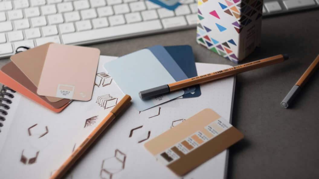
What “Minimalist Typography” Actually Means in 2025
Minimalism isn’t just “thin fonts” or “lots of white space.”
Real minimalist typography reflects system thinking:
1. One primary typeface family
Not four.
Not two.
One.
2. Three headline weights maximum
Brands are finally resisting the urge to over-style.
3. Ultra-clean, grid-aware spacing
Not cramped.
Not loose.
Just intentional.
4. Functional contrast
Large vs small.
Bold vs regular.
Tight vs open.
Contrast becomes a structural choice, not decoration.
5. Typography behaving like architecture
Form follows logic.
Logic follows hierarchy.
Hierarchy creates meaning.
This is why premium SMEs are adopting minimalist type:
It scales without falling apart.
Examples of Minimalist Typographic Behavior in the Wild
- European boutique hotels adopting mono-weight grotesques
- Premium fintech SMEs moving to wide-set sans fonts
- Scandinavian interior brands using serif/sans dual systems with strict logic
- Luxury wellness companies reducing all headline sizes to a simple modular scale
The signal is the same everywhere:
Typography is becoming a structural asset, not a stylistic one.
What This Shift Means for Your Brand System
Typography is the most repeated part of your identity. More than your logo. More than your photography. More than your color palette.
- If the system is weak, everything behaves inconsistently.
- If the system is strong, even basic layouts look premium.
Minimalist typography works because it:
- reduces internal design errors
- strengthens brand perception
- increases clarity across touchpoints
- makes content easier to produce
- creates a foundation for future growth
It doesn’t limit creativity. It limits exceptions. And that’s what creates coherence.
As we often say at BRND360º:
When the structure is right, the style works harder.
PRO TIP
If your typography needs more than a refresh, the Brand Identity Design service at W360º is built to redesign systems from the inside out.
What’s Your Take on the Minimalist Typography Shift?
Do you see it as clarity, or as a visual oversimplification?
Share your thoughts below. Your comment might help another founder rethink how typography shapes perception.


Finally someone explains the SYSTEM reason behind this trend. Not just ‘minimalism is in.’ Love this.
Thanks so much, Alicia. Super happy to be able to give you new points.
As a small tech founder, this hit home. Our typography is all over the place. Time to simplify.
Awesome, Tomas. Share your results if you think so.
Beautifully written. The point about internal teams breaking brand consistency, spot on.
Thank you so much, Martina. I do my best.
Interesting! I always thought minimalist type was a style choice. Didn’t realize it’s more of an operational advantage.
Happy to show up something new, Leo. Thank you for your feedback.
We switched to a single sans family last year. The clarity boost is insane. Great analysis.
Sounds exciting, Rina. Feel free to reach out and share your results.
Typography behaving like architecture… chef’s kiss. That’s exactly it.
Thanks, Matteo. You made my day.
This explains why premium brands feel calm and structured. Learned a lot from this post!
Happy to hear that, JunSEO. Enjoy and use!
Minimalism=fewer arguments between our marketing team and designers. Truly a system win.
You got it, Hannah. Totally agreed.
Very relevant for SMEs here too. Everyone uses bold decorative fonts… and it shows.
Thanks so much for sharing your thoughts, Youssef.
Love the idea of contrast as a structural tool, not just style. Makes so much sense now.
Great, happy to hear that, Clara. Thank you for your feedback.
Super clear breakdown. Will be applying some of these rules to our 2026 redesign.
Thanks so much, Lars. Let us know when any results get happened.